
Graph maker
Highlight key patterns and simplify complex information using graph and chart tools in Microsoft Excel.

Create visualizations that are clear and accessible
Get chart recommendations with Copilot
Copilot in Excel reviews the selected data and recommends chart types suited to the information. It highlights options that show comparisons in balance sheets, trends in budget planners, and data relationships clearly. Preview suggestions side by side to choose a chart that presents the information clearly.
Customize charts to match a brand style
Adjust chart styles, colors, and fonts to create a consistent look across spreadsheets. Format axes, labels, and data points to make insights easy to follow. Use layout tools to position chart components clearly so the final visual supports reports such as inventory trackers, or business budgeting presentations.
Вставка диаграмм Excel в другие приложения в виде изображений
Добавляйте диаграммы Excel в Word, PowerPoint и Teams в сети, вставляя их в виде изображений, чтобы сохранить согласованный макет и форматирование диаграмм во всех приложениях. Автоматическое обновление недоступно в веб-приложениях, но диаграммы можно обновить, обновив их в Excel и заменив изображение в документе или презентации.
Build charts faster with customizable templates
Use customizable Excel templates to build polished charts quickly. Add data to the pre‑formatted tables and the charts update automatically.
Уточняйте диаграммы с помощью Copilot
Используйте Copilot в Excel для создания диаграмм, которые помогают визуализировать шаблоны и тенденции в данных. Выберите диапазон для просмотра аналитики, которая выделяет сравнения, изменения или связи между значениями. Copilot представляет эту аналитику в виде диаграмм, упрощая интерпретацию и изучение ключевой информации.

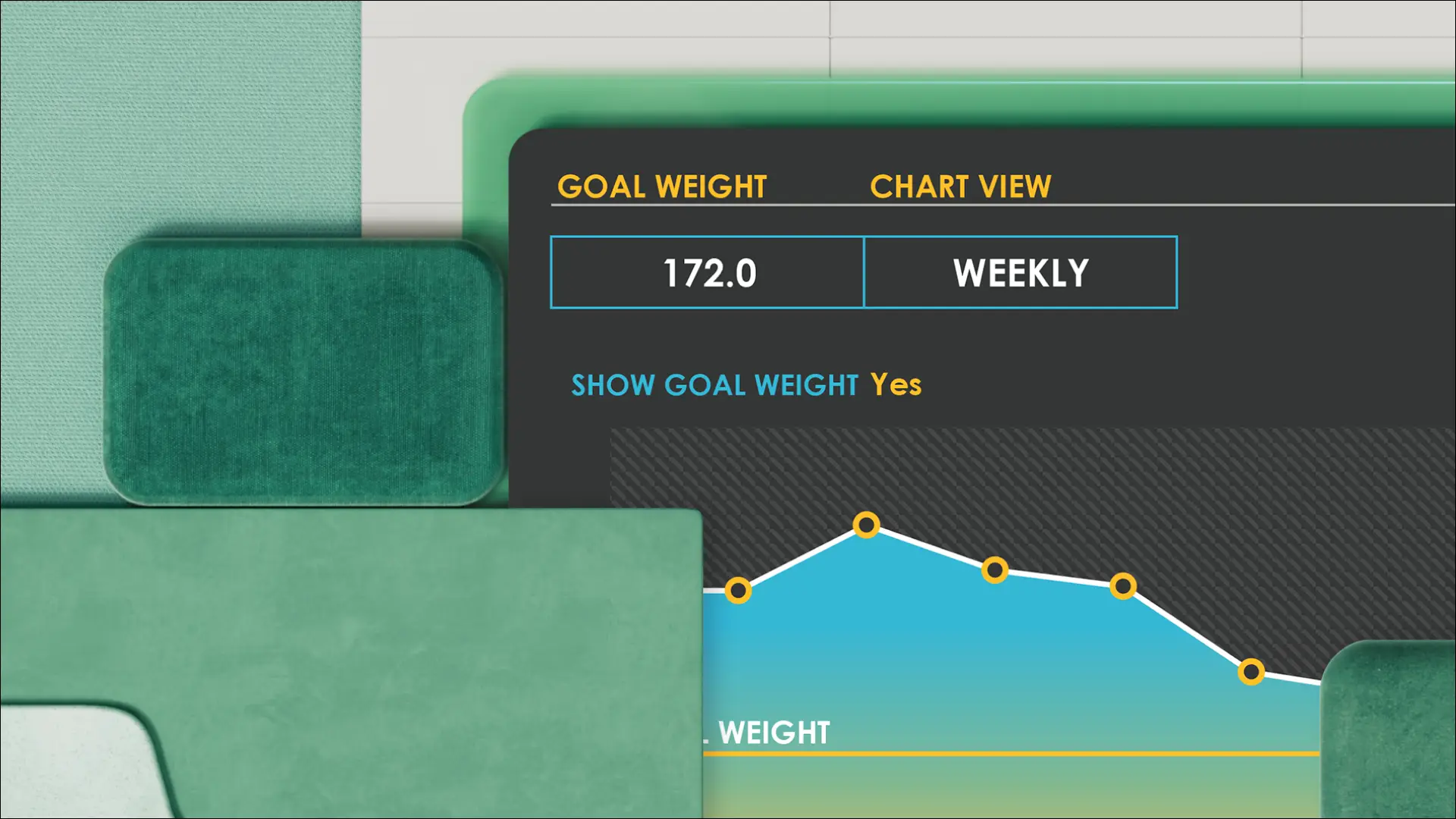
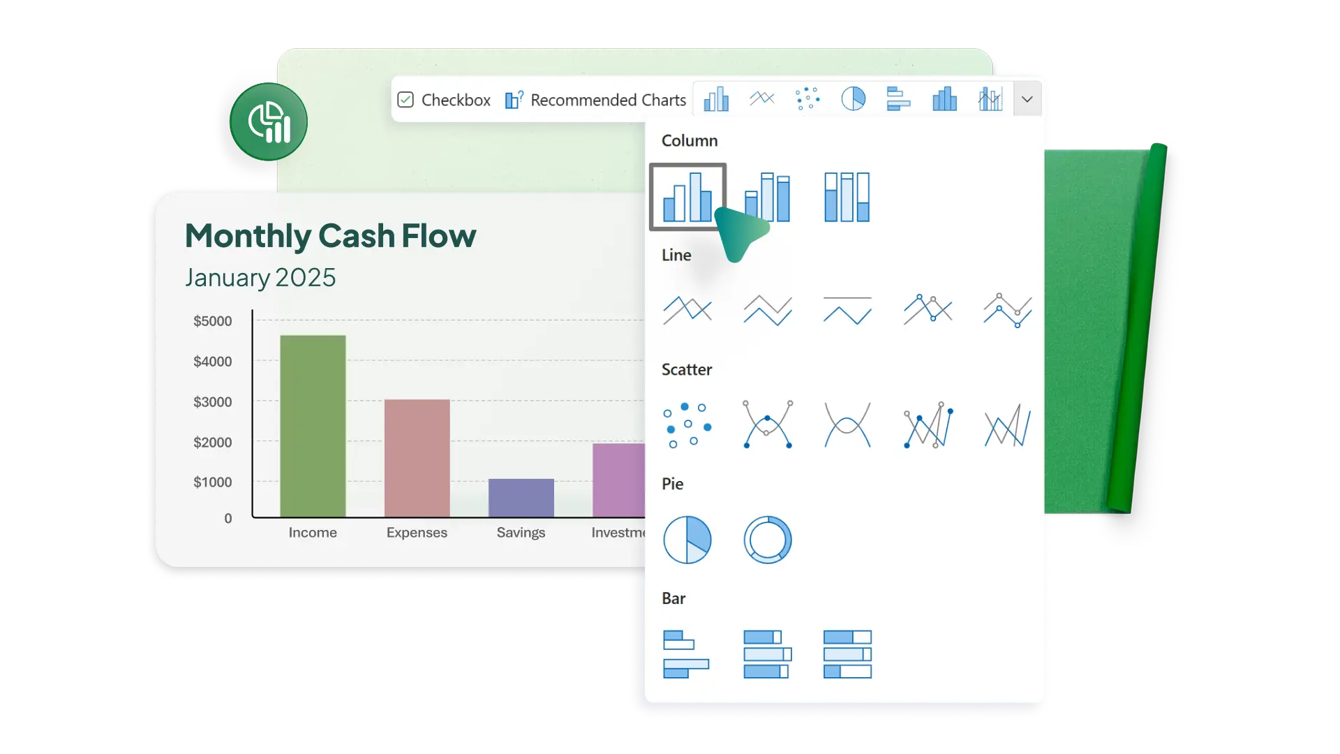
Choose chart types that explain data effectively
Use a wide range of chart and graph types to choose the strongest visual. Show changes over time with a line chart or display parts of a whole with a pie chart. Get quick recommendations for chart ideas based on a data set with Recommended Charts, which is useful for jumping into analysis. Create the ideal chart to communicate trends effectively.
Format charts for clear, confident presentation
Adjust axes, labels, color palettes, and data series to make patterns easier to interpret. Apply simple layout refinements that help important summary data from timesheet entries, or identified trend patterns from business budgets stand out. Support the chart with conditional formatting in the source data table to visually reinforce the trends being shown.

Collaborate on charts in real time
Work with others to create and update Excel charts in real time. Choose to share full editing access, comment, and view-only permission based on what each person needs to do. Track progress with comments, tasks, and tags directly in co-authored spreadsheets for project management and restore past states with version history. Keep everyone on the same page with graphs that update automatically when editors modify table data.

Общий доступ к диаграммам и их представление
Поделитесь рабочей книгой Excel, чтобы сделать данные таблиц и графики доступными для просмотра в Интернете. Добавьте ссылку общего доступа на слайд PowerPoint, чтобы включить данные в презентацию и показывать обновленные диаграммы. Проводите презентации в Excel Live в Teams, чтобы участники совместной работы могли видеть изменения данных в режиме реального времени и вносить свой вклад в новые визуализации. Передавайте графики актуальных данных из одного приложения в другое внутри организации или за ее пределами.

How to create charts and graphs in Microsoft Excel
1. In a browser, Excel chart templates or start with a blank document
2. Organize table data for the graph or chart with figures and column titles
3. Create a chart with the Insert menu, or work with Copilot to pick the most effective chart type
4. Customize chart colors, fonts, and styles to match a brand
5. Download, print, or share the chart or graph online for free


Frequently asked questions
How to make a line graph in Excel?
Create a data table, then use the Insert menu to choose a Line graph that works for you. Line graphs work well for time-series or sequential data. Excel for the Web offers multiple 2D line options.
How to make a bar graph in Excel?
Click the Bar icon in the Insert menu to create a bar graph based on a data table. You can choose options like clustered or stacked bar charts to compare data values across categories.
How to make an X-Y graph in Excel?
Create a table with columns for X and Y values, then insert a Scatter graph. The Scatter graph will display four quadrants if both X and Y values include positive and negative numbers.
How to add a vertical line in an Excel graph?
Use the Shapes option in the Insert menu to add a straight line over a chart as an overlay. This will function as a quick indicator to place over a point on a graph.