
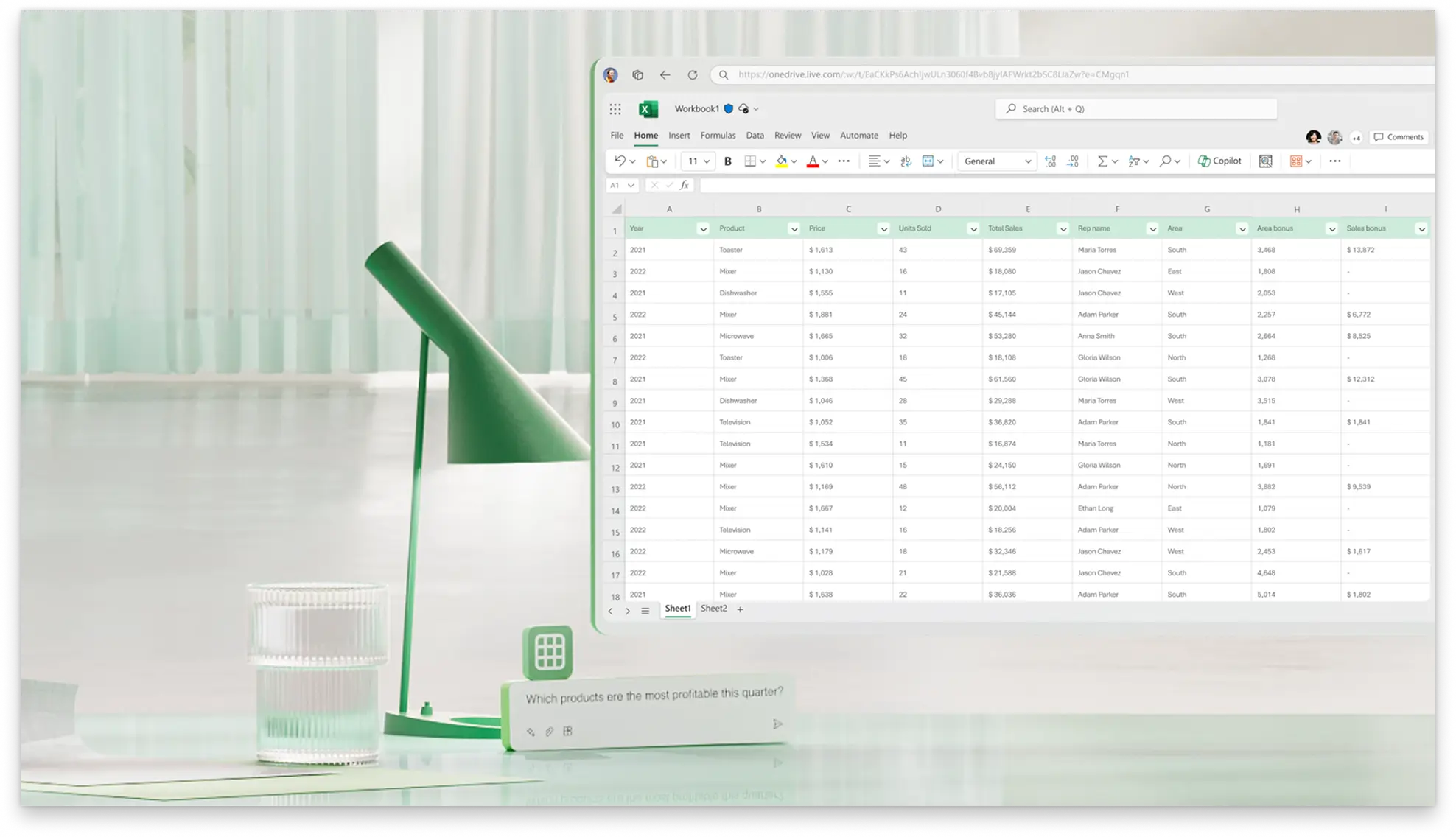
AI data visualization
Turn data into charts, graphs, and dashboards to showcase insights clearly using Copilot in Microsoft Excel.

Make engaging visuals with AI
Prepare datasets for clear visuals
Clean up datasets by spotting missing values and standardizing rows with AI. Get suggestions for which chart type fits the data, so visuals are easy to interpret.
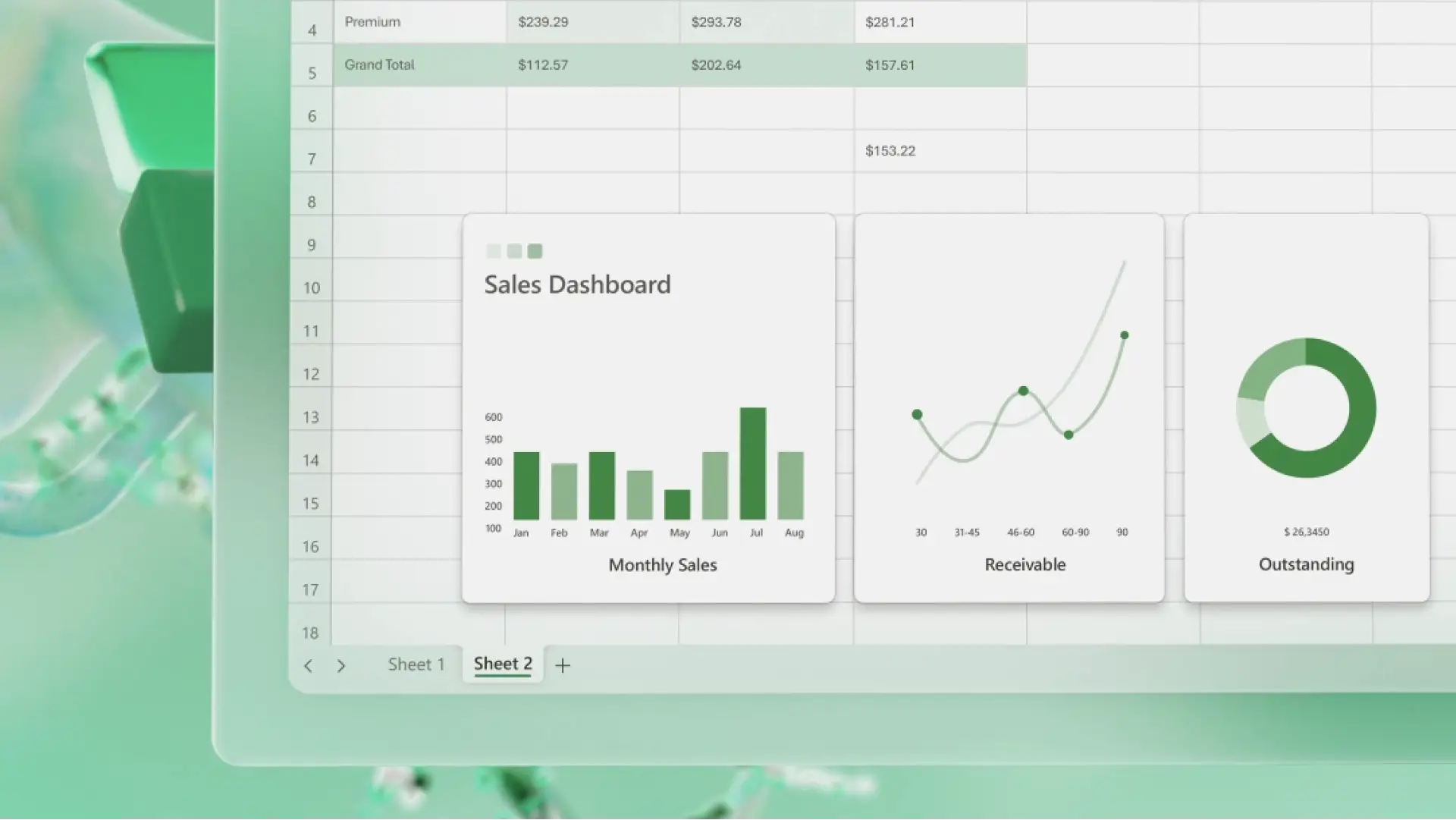
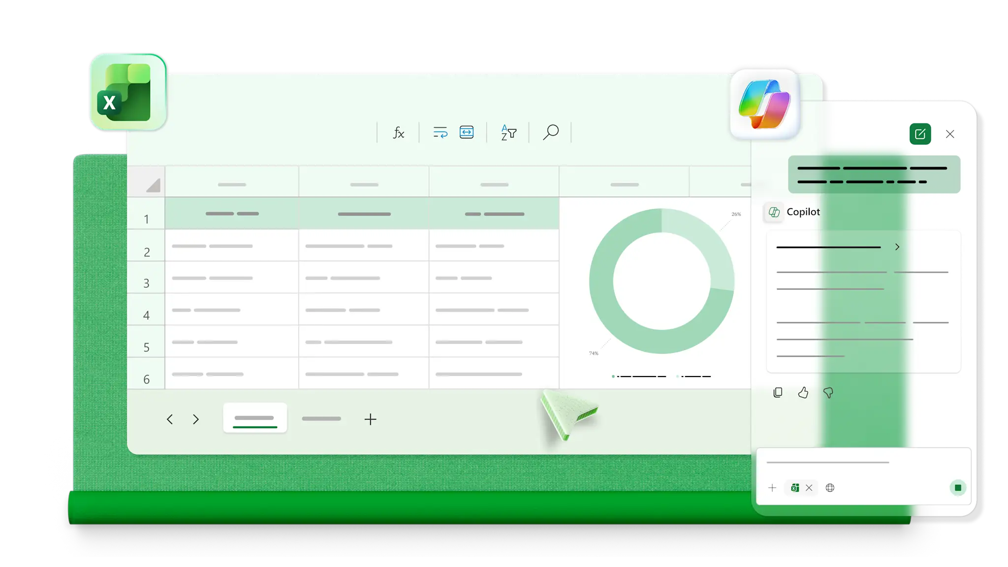
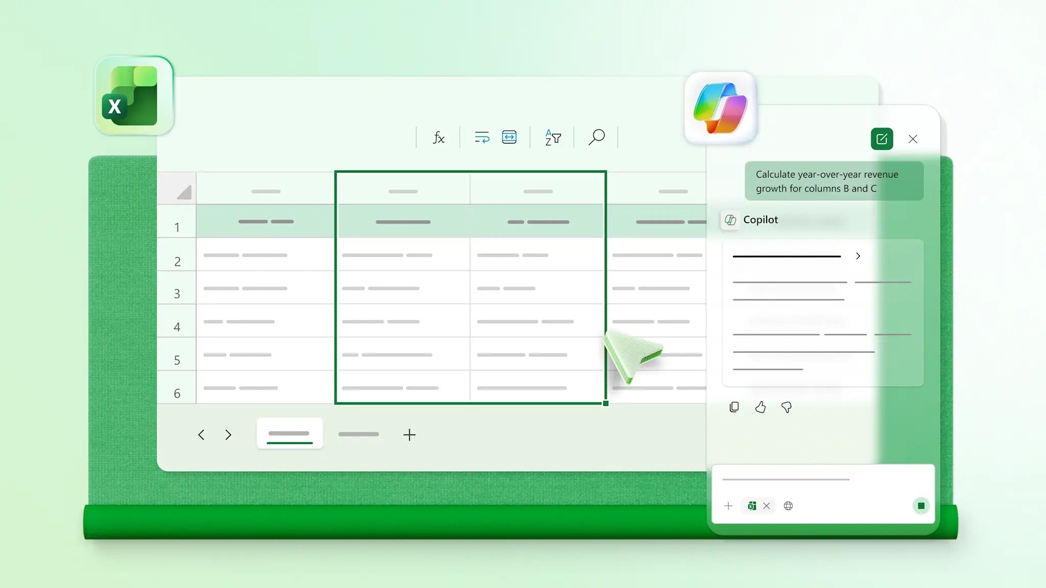
Build charts and dashboards with AI
Describe the visuals needed in Copilot chat, such as sales by region or expenses per month, and AI will suggest bar charts, line charts, or dashboard layouts.
Highlight patterns and trends
Use Copilot to highlight patterns in the data, or showcase high and low values in any spreadsheet. Build forecasts based on existing trends to project future results.
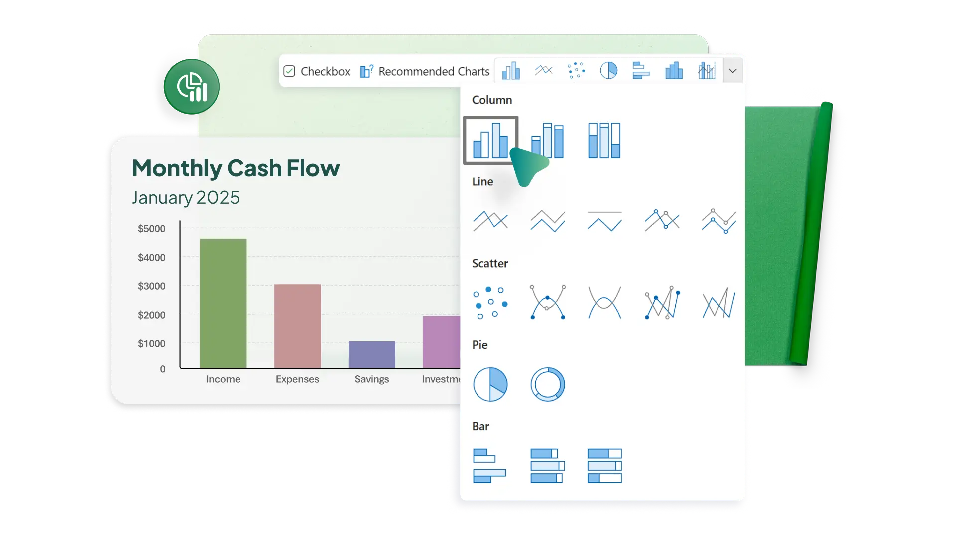
Review data to choose formats
Use AI to review tables or data formats to suggest which chart type suits the spreadsheet. Ask AI about types of data visualizations like line charts and Gantt charts, then decide what visualization format to use for the data set.
Compare categories with charts
Identify highs and lows with bar charts, or see percentage breakdowns with pie charts generated by Copilot. Review and combine layouts for side-by-side comparison of sales and inventory data in business spreadsheets.

Track trends with line charts
Follow and report how values change over time using line charts or time series charts. Chat with Copilot to identify date columns in the dataset and create line charts that display trends clearly. Track sales growth or project progress across time.
Show patterns with heatmaps and colors
Use Copilot to make data stand out visually. Apply color codes to highlight key values and patterns, or generate heatmaps to show high and low values for easy comparison. Ask AI to spotlight key numbers in sales charts or marketing targets.

Project trends with forecast charts
Analyze patterns in existing data to estimate future performance using AI forecast charts. Compare changes to plan ahead and run a business or household budget smoothly. Visualize where trends are heading to make confident decisions.

Create performance dashboards with AI
Track and share insights using dashboards and make decisions with clarity. Chat with Copilot about dashboard elements and layouts to present data clearly. Build sales dashboards to analyze growth, or performance dashboards for business reviews.
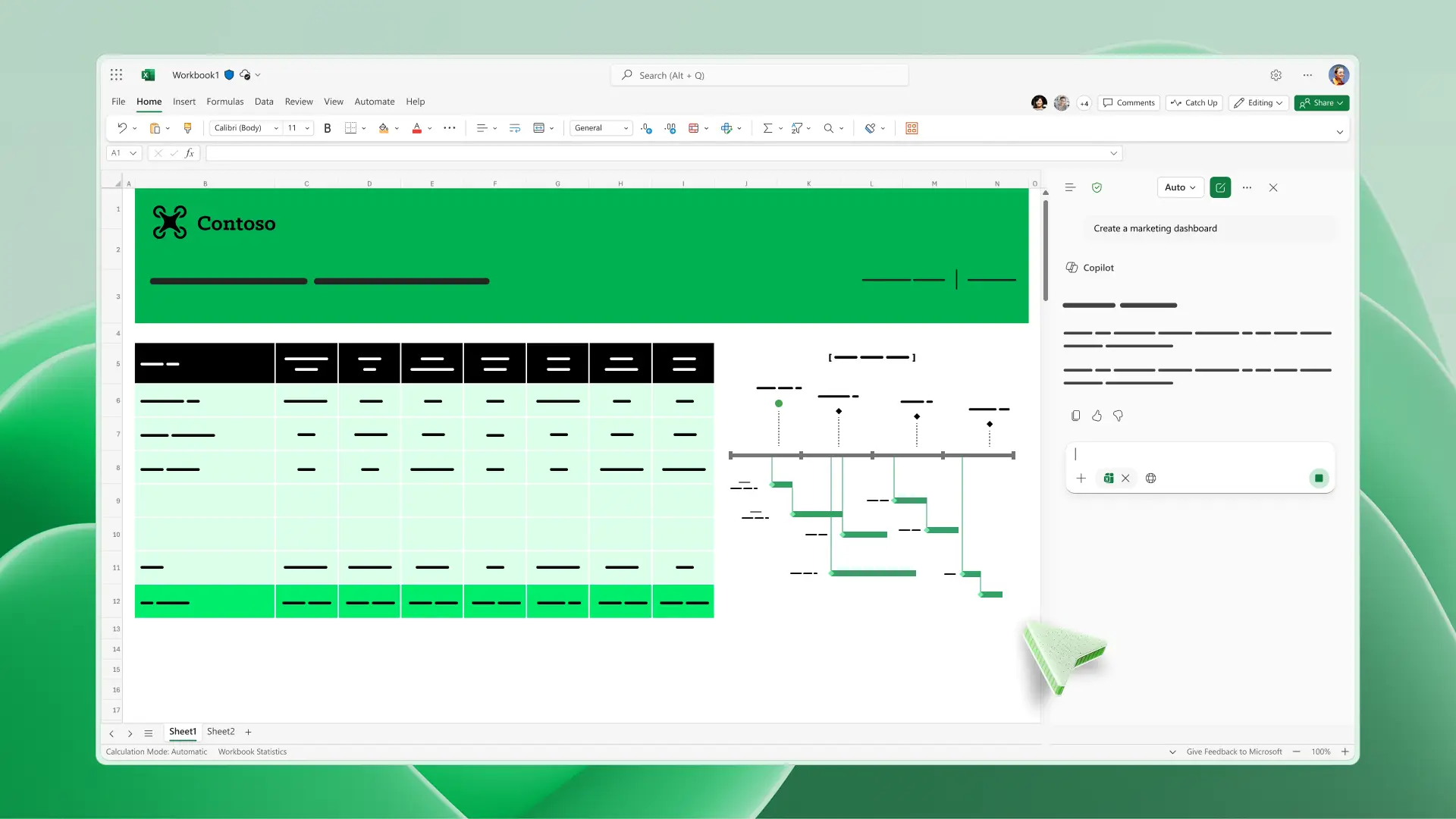
Build a reusable workflow
Create a custom Excel template with AI suggestions. Attach the dataset in Copilot chat, and get suggested layouts and charts. Setup reusable dashboards to use across reporting cycles to save time on weekly or monthly updates.
How to make an AI data visualization in Excel
Open a spreadsheet with the data to visualize in Excel for the web.
Describe the visualization needed in Copilot chat, such as a bar graph, line chart, or dashboard.
Review the suggestion and check that the data range is selected correctly.
Apply the visual to the sheet and refine labels, colors, or structure as needed.
Read more

Frequently asked questions
How do I enable Copilot in Excel?
Find Copilot in Microsoft Excel by opening the app and locating the Copilot icon. Editing with Copilot in Excel requires either a Microsoft 365 Personal or Family subscription (with an AI credits plan), a Microsoft 365 Premium subscription, or a commercial Microsoft 365 Copilot subscription.
Can Copilot create charts in Excel?
Describe the chart needed to Copilot and it will suggest a visualization format based on the dataset. Review the suggestion, confirm the data range, and insert the chart into the sheet.
Can the AI-generated graphs be updated?
Update charts by modifying the source data or adjusting settings in the chart editor.
What types of visualizations can be created in Excel?
Create bar graphs, line charts, pie charts, heatmaps, time series charts, forecast visuals, and full dashboards in Excel. Copilot can recommend the right chart type based on the dataset structure.