How to create a summary table in Excel with AI
Turn raw data into concise summary tables, or PivotTables, for easier review in Microsoft...
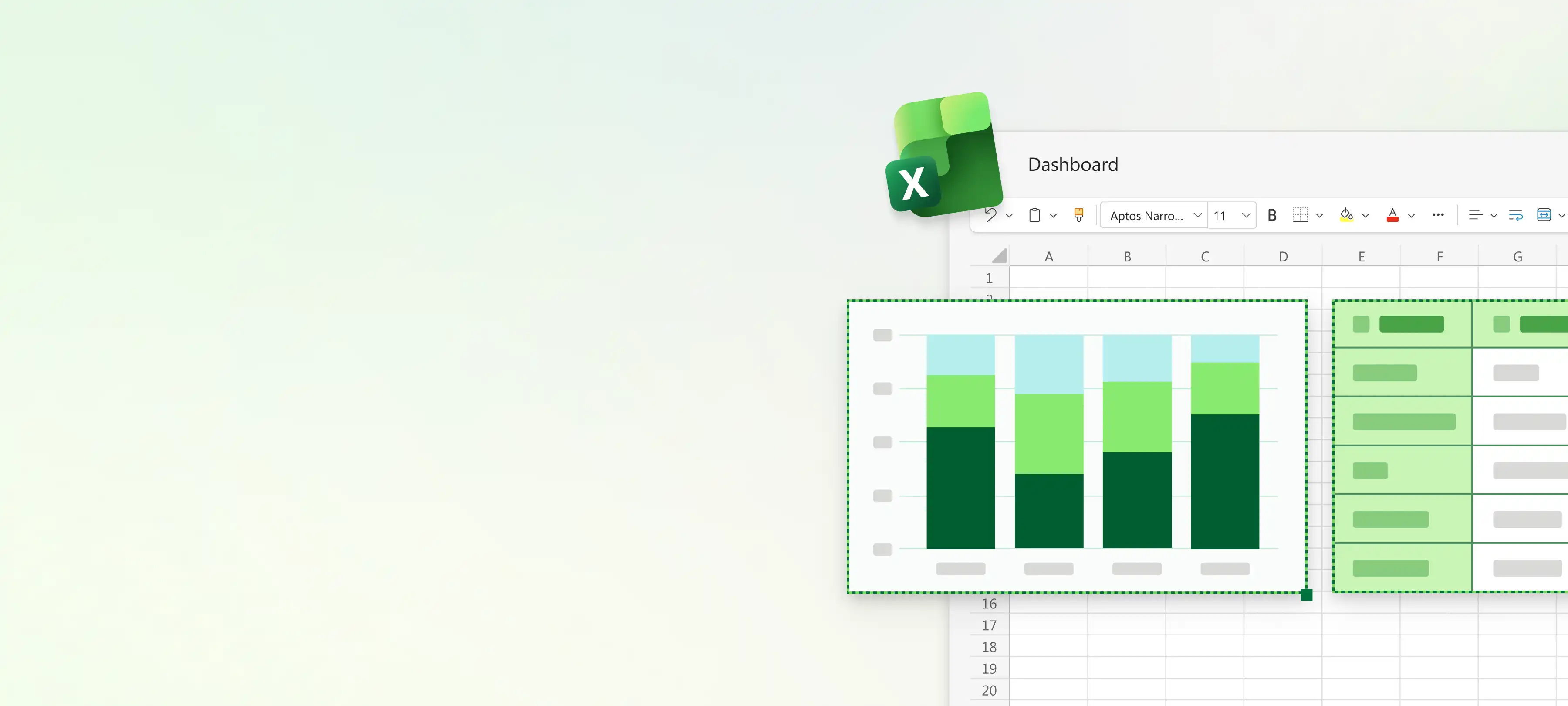
Turn data into dashboards and reports to track performance or show trends and insights with charts, tables, and AI in Microsoft Excel.

Connect data from existing spreadsheets, reports, and business records to build dashboards. Choose from charts, tables, and KPI indicators to create a good dashboard layout.

Add slicers and filters to explore data by product, region, or time period to see specific insights. Use conditional formatting to highlight trends, progress, and results that need review.

Chat with Copilot in Excel to identify and understand dashboard trends. Ask for formula or visual suggestions to make calculations and present results, then review and apply to dashboards.

Connect data from spreadsheets, reports, and CSV files into one workbook. Use Excel tables and Power Query to clean and organize data before building a dashboard. Create a consistent data source to make reports easier to update and review.
Define the metrics, KPIs, and trends the dashboard should display. Ask Copilot to suggest what to include, then review the suggestions before applying them. Build a layout that can be reused to create custom inventory sheets or reliable budget reports.
Make interactive sheets with slicers, filters, and timeline controls. Filter reports by product, region, campaign, or time period with a single click. Connect slicers to PivotTables and charts so anyone can adjust the dashboard to see results that are relevant to them.
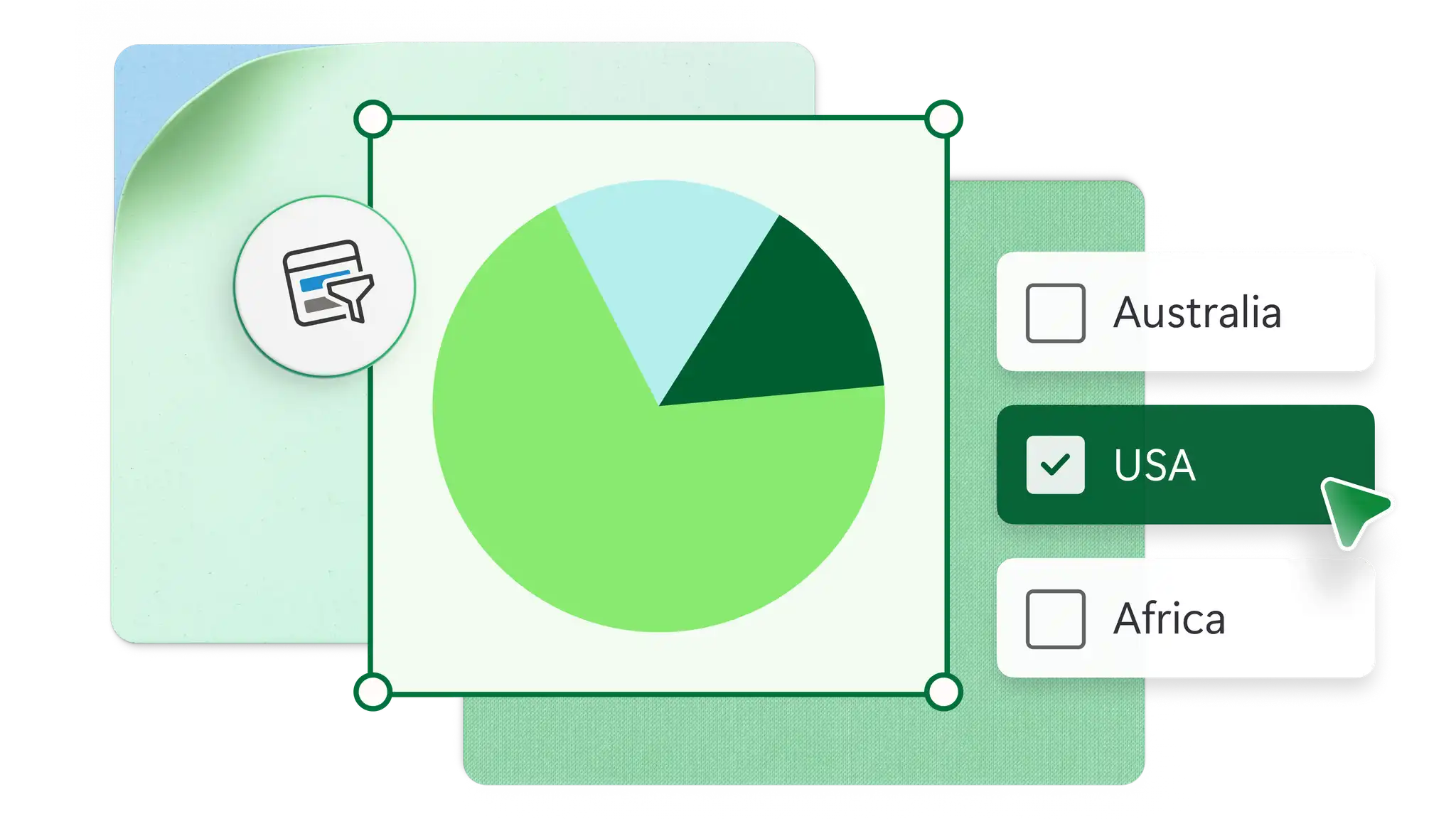

Review dashboard metrics to understand performance and spot trends. Use AI assistance to summarize data, find patterns, and highlight key insights inside Excel for the web. Share reports for recurring business reviews using secure online links or export as PDF.
Open an Excel spreadsheet with figures and organize it in a consistent table with clear headers.
Create a PivotTable to summarize results and calculate totals, averages, or counts.
Add charts to visualize trends and slicers to filter data by category, region, or time period.
Arrange elements on one sheet to create a dashboard view that is clear.
Share the dashboard securely with an online link or save as a PDF.
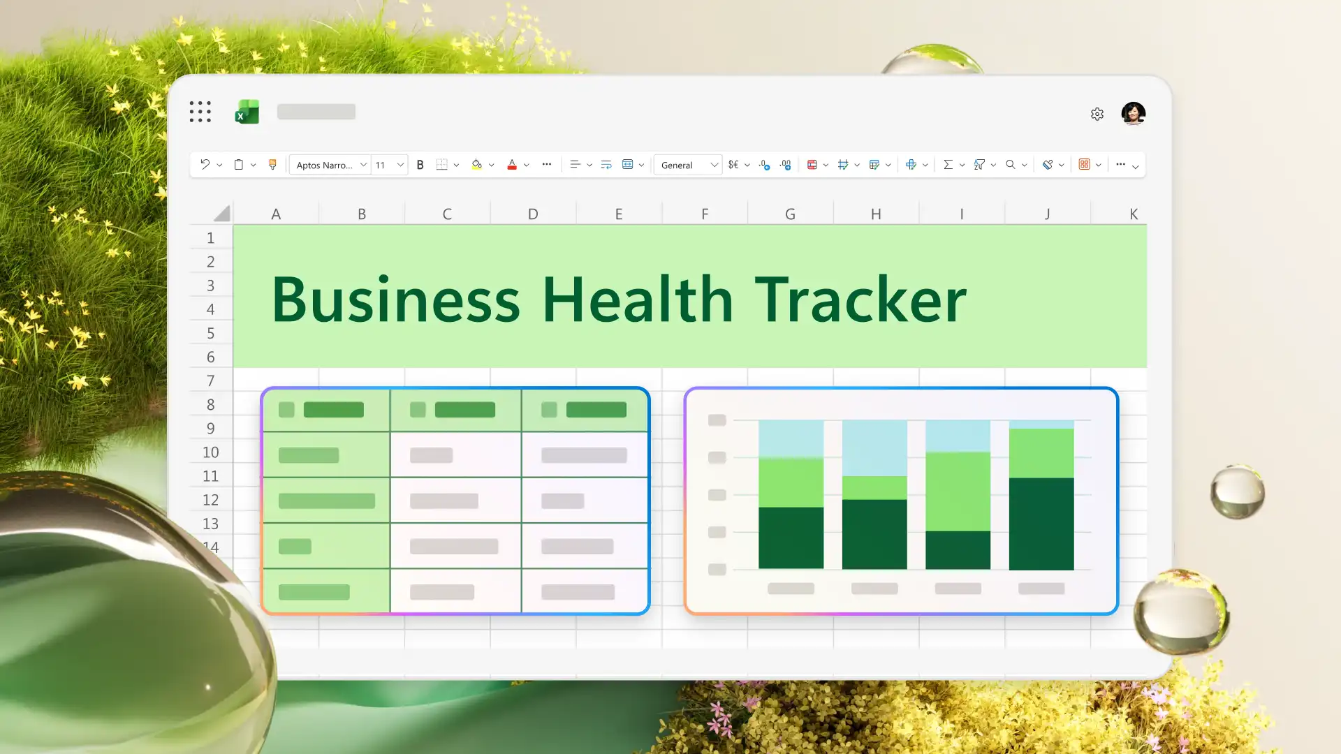
An Excel dashboard displays key metrics, trends, and performance data in a single view. Businesses use dashboards to track sales, monitor budgets, manage projects, and report on KPIs. Dashboards make it easier to spot patterns and share results with teams.
Common Excel dashboard features and tools are PivotTables, charts, and slicers. PivotTables summarize data, charts visualize trends, and slicers filter connected views. Conditional formatting and sparklines help highlight important changes and patterns.
Copilot can help with dashboard creation by suggesting formulas or data visualization styles, summarizing data, and identifying trends. After building a dashboard, ask Copilot to find patterns or explain what the results mean. Review AI suggestions as a starting point, then refine and apply to the report.